Resource icon

XF2 Style SpaceX 2.2.13.1

No permission to download

DubSac

Member
Registered
Joined
Nov 30, 2018
Messages
10
Points
13

Reputation:

Screenshot 1 is the Home Page with no breadcrumbs.
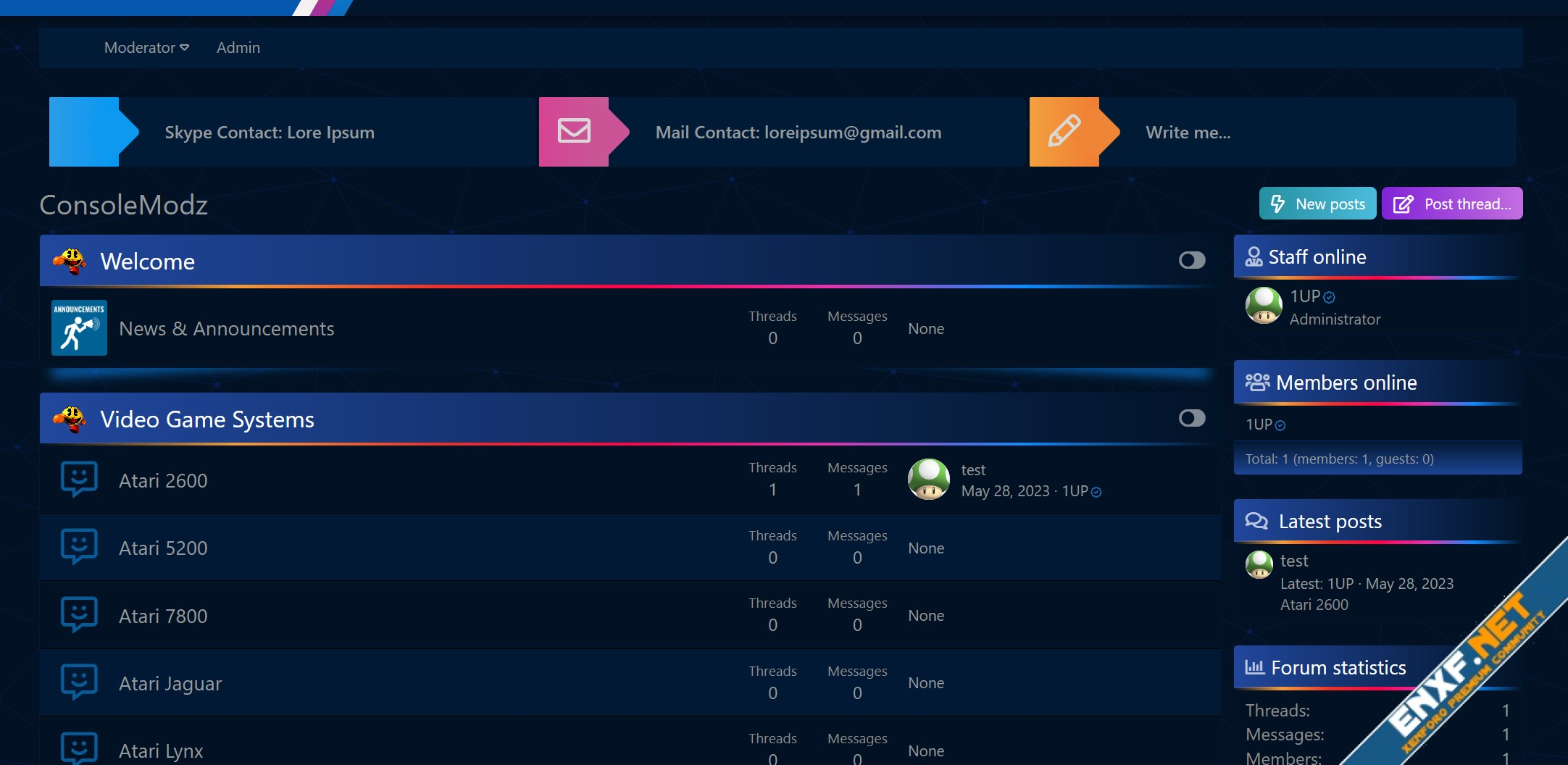
1.jpg


Screenshot 2 is Forum View with the breadcrumbs which also contains the Hide sidebar and forum width buttons.

2.jpg
 

BattleKing

Spirit of darkness
Staff member
Administrator
Moderator
+Lifetime VIP+
S.V.I.P Member
Collaborate
Registered
Joined
May 24, 2020
Messages
3,519
Points
523

Reputation:

BattleKing

Spirit of darkness
Staff member
Administrator
Moderator
+Lifetime VIP+
S.V.I.P Member
Collaborate
Registered
Joined
May 24, 2020
Messages
3,519
Points
523

Reputation:

If you get the following problem

1687796202398.png


You need to add a widget:
1687796217715.png


After that it looks like this:
1687796240149.png
 

APPG

Active member
Registered
Joined
Nov 23, 2022
Messages
42
Points
18

Reputation:

Hmm, the footer is not showing for me..

FireShot Capture 094 - FilesBoard - 198732.png


After turning on the extrafooter, i.e. these columns, it cuts the bottom..
 

DubSac

Member
Registered
Joined
Nov 30, 2018
Messages
10
Points
13

Reputation:

@BattleKing
For some strange reasons that are unknown, with my hoster (NameCheap), I cannot get the breadcrumbs to work on the forum index.
It's the same on both of my sites.
But I know it works as I have tested it on a local install!

Well I decided to go through this style a bit and fix the main 2 issues that has been brought up in this discussion.
The "NEW" icon and the widget footer issues.
For the footer widget I changed it to Newest Members widget so no need to create a widget anymore and the footer works on install!
Screenshot 2023-06-26 141254.jpg


If anyone is interested I uploaded the style as an installable archive!

Edit (moderator): will update a new version soon with your changes as well. Just want to do some extra checks.
 
Last edited by a moderator:

BattleKing

Spirit of darkness
Staff member
Administrator
Moderator
+Lifetime VIP+
S.V.I.P Member
Collaborate
Registered
Joined
May 24, 2020
Messages
3,519
Points
523

Reputation:

jommytonny888

Well-known member
Registered
Joined
May 31, 2022
Messages
166
Points
28

Reputation:

jommytonny888

Well-known member
Registered
Joined
May 31, 2022
Messages
166
Points
28

Reputation:

solution above has fixed my problem.
 

Attachments

  • lll.png
    lll.png
    8.1 KB · Views: 84
Last edited:

Ave12

Active member
Registered
Joined
Jun 8, 2023
Messages
31
Points
8

Reputation:

Maybe it will come in handy for someone, initially in the mobile version of the template there is a bug in the mobile version of the header, when scrolling through the pages, it jumps up and down, I fixed this bug and adapted it for phones.

Replace the original code with mine.

Template name: app_stickynav.less

Code:
.p-navSticky {
  z-index: @zIndex-1;

  &.is-sticky {
    z-index: @zIndex-4;
    .m-dropShadow(0, 0, 8px, 3px, 0.3);
  }

  @supports (position: sticky) or (position: -webkit-sticky) {
    & {
      position: -webkit-sticky;
      position: sticky;
      top: 0;

      &.is-sticky-broken,
      &.is-sticky-disabled {
        position: static;
        top: auto;
      }
    }
  }

  @supports (max-width: 767px) {
    position: fixed;
    top: 0;
    left: 0;
    width: 100%;
    z-index: @zIndex-4;
    .m-dropShadow(0, 0, 8px, 3px, 0.3);
  }

  @supports (min-width: 768px) and (max-width: 1023px) {
    position: fixed;
    top: 0;
    left: 0;
    width: 100%;
    z-index: @zIndex-4;
    .m-dropShadow(0, 0, 8px, 3px, 0.3);
  }
}
 
Last edited:

originalBugs

Active member
Registered
Joined
Jul 26, 2023
Messages
27
Points
3

Reputation:

in mobile view menu bar and logo sifted to right side , if there is any solution for this kindly provide me.
brave_v3hQCiHfwG.jpg
 

Ave12

Active member
Registered
Joined
Jun 8, 2023
Messages
31
Points
8

Reputation:

Ave12

Active member
Registered
Joined
Jun 8, 2023
Messages
31
Points
8

Reputation:

Good day to all. As practice has shown, my past code did not suit everyone. And there were also bugs with the top navigation on mobile devices. So I found another simple but effective way. This method should 1000% fix top navigation twitching once and for all. this fix is generic. For the old version of the template and the new one.

We tested this fix for errors on 4 sites, everything works as expected!


Add to SpaceXNavbar.less

/* Adaptation for mobile version in PC mode */
@media (max-width: 1000px) {
.p-navgroup-link:first-of-type.p-navgroup-link--whatsnew+.p-navgroup-link {
border-top-left-radius: 4px;
border-left: none;
display: none;
}

.p-nav-scroller {
margin-right: auto;
max-width: 100%;
flex: 1;
text-align: right;
}

.p-sectionLinks, .p-header {
display: none;
}

.p-navSticky.is-sticky .p-nav .p-nav-list .p-navEl.is-selected, .p-navSticky.is-sticky .p-nav .p-account {
border-radius: 55px;
}

.p-header-logo {
position: relative;
vertical-align: middle;
margin-left: -1%;
padding: 30px 0;
}

.p-header-logo a {
color: inherit;
position: relative;
text-decoration: none;
z-index: 1;
}

.p-nav-scroller {
top: -16px;
}

.p-nav-opposite {
position: relative;
top: -16px;
}

.has-js .p-nav .p-nav-menuTrigger {
display: inline-block;
z-index: 2;
}

.p-navgroup-link--whatsnew {
display: none;
}

.has-js .p-nav-opposite .p-navgroup {
top: 15px;
background: #113153;
margin-left: 0;
max-width: 30%
position: relative;
}

.p-header-logo-Slash1 {
display: none;
}
}

Reset the default setting: app_stickynav.less

1. Open https://Your-Site.domain/admin.php?styles/YourStyleName/style-properties/group&group=headerNav

2. Find Sticky navigation element.

3. Check the box next to Primary and sub-navigation rows. Save and enjoy.
 
Last edited:

Momon

Member
Registered
Joined
Jul 10, 2023
Messages
10
Points
3

Reputation:

Top